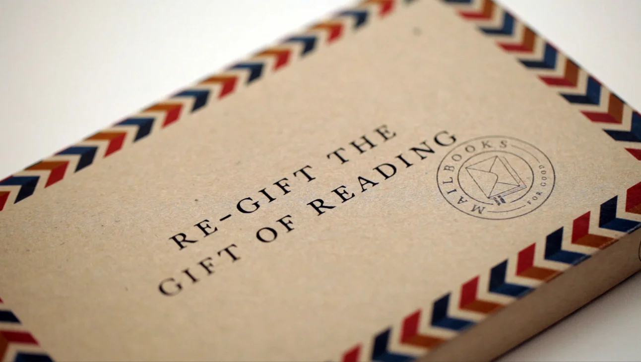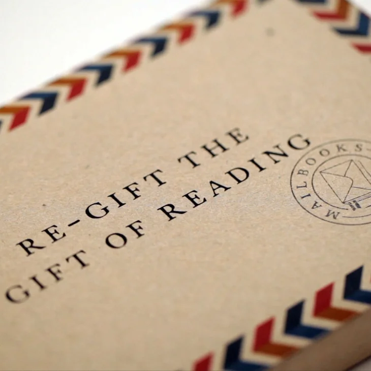
Mailbooks For Good is an innovation in book publishing, which allows you to donate books directly to those who need it.
When the books are finished, readers simply turn the covers inside out and the books become pre-paid and pre-addressed packages. Once posted they are sent directly to the charity for distribution to those in need.
Working with a small project team to bring this idea to life, we started with prototyping the fully operational dust jacket mechanism itself. From there, the brand identity was created to give this initiative its own unique look and feel, one that stood out from the crowd and was instantly recognisable within leading book stores in Australia.
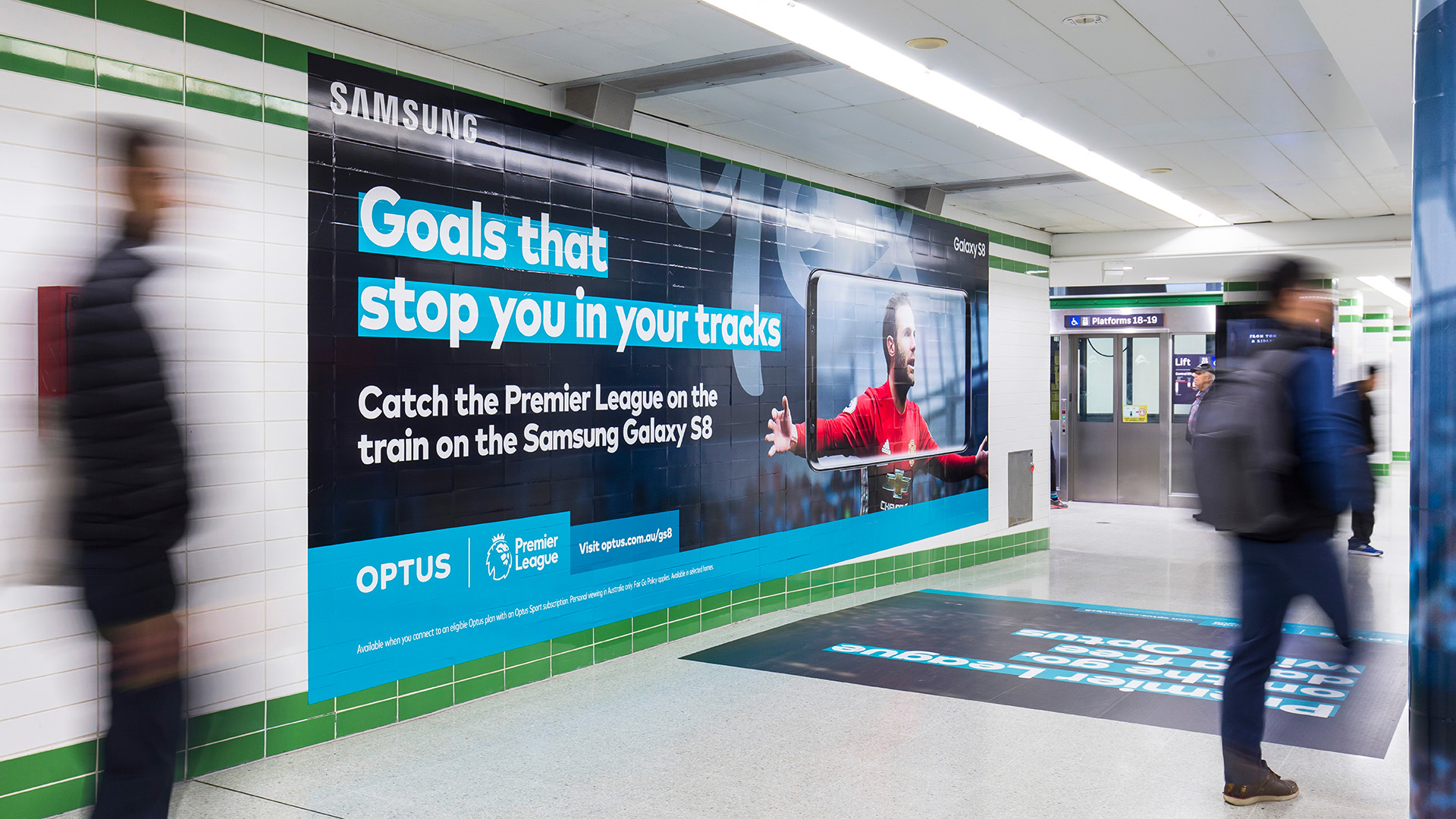
While there’s a fair bit of work here, believe me when I say that this is just the tip of the iceberg. Working heavily on the Optus brand over a 3 year period, I took part in its evolution from the world of Ollie (he’s the little yellow guy toward the bottom of the page), to a more sophisticated brand with a focus on Optus becoming a provider of not only all things telco, but an entertainment destination also. The opportunity to heavily influence this evolution along the way was a truly rewarding experience.
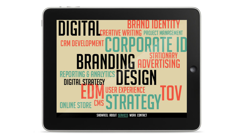
I worked as a core member of a small team responsible for a multitude of marketing material, from digital banners, shop windows and fit outs, to fully fledged integrated campaigns.
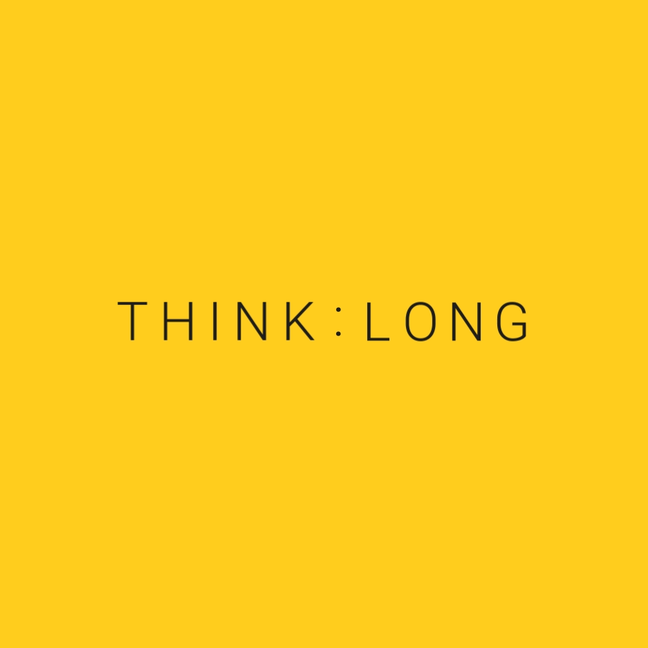
Think:Long is a mini-summit and panel discussion dedicated to creative leaders addressing creative longevity.
The ever blinking colon within the lockup serves to represent the scale of time. A simple idea, simply executed, for immediate impact.
The world’s best new films come to Sydney every June for 12 days and nights of inspiring and entertaining premieres, talks and parties.
However, they need donations to stay alive! We reached out to potential donors with this campaign through cinema advertising, online display, and social. We created a visual look and feel which pays homage to traditional cinema.
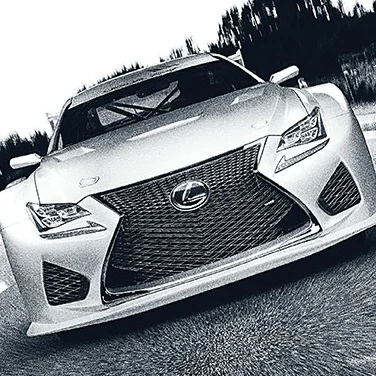
Here is a snapshot of some of the work created for Lexus over the few years I worked on the brand.
Toward the bottom of the page, you’ll find the concept brochure redesign work which has informed the look and feel of their brochures today.
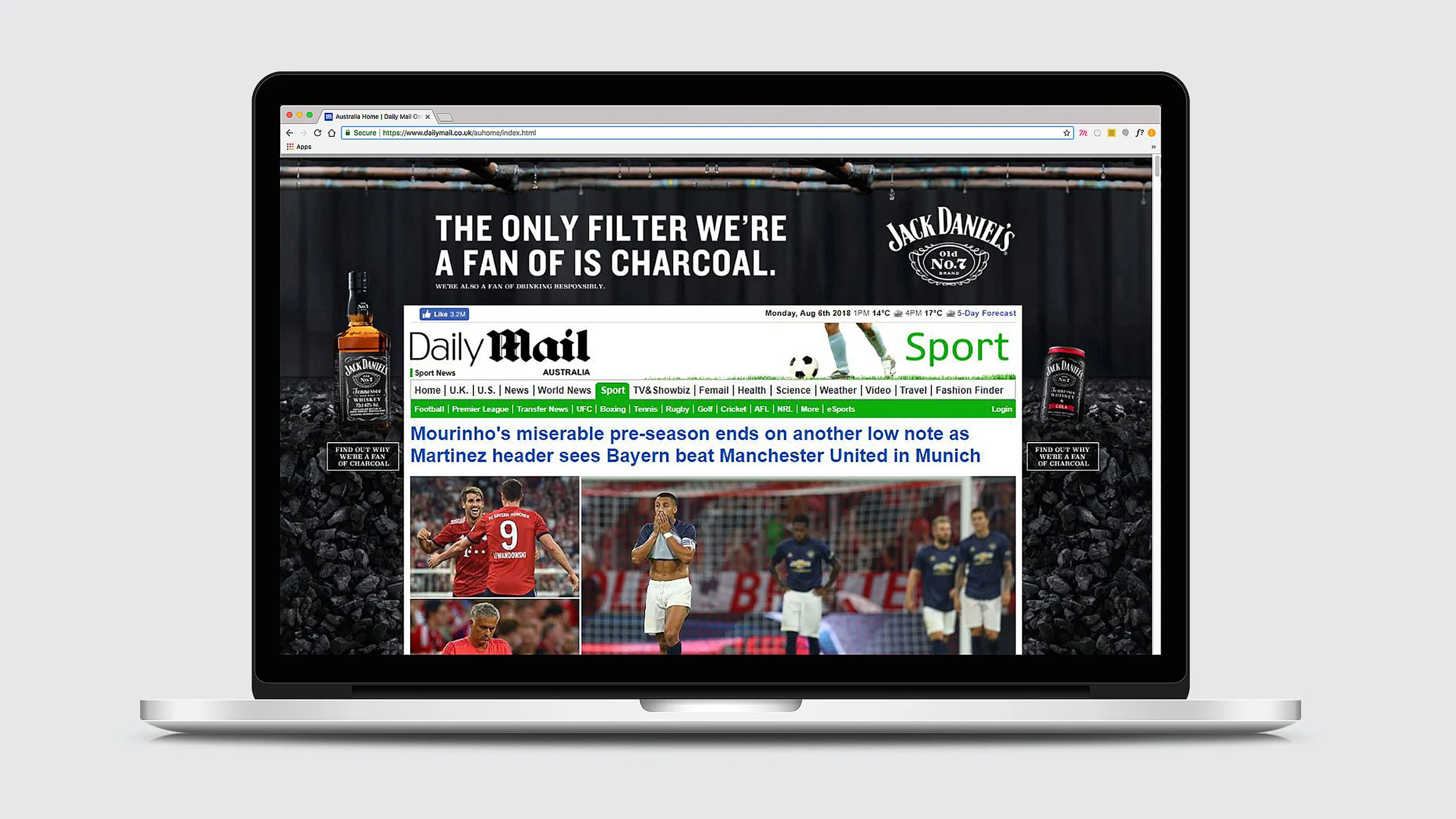
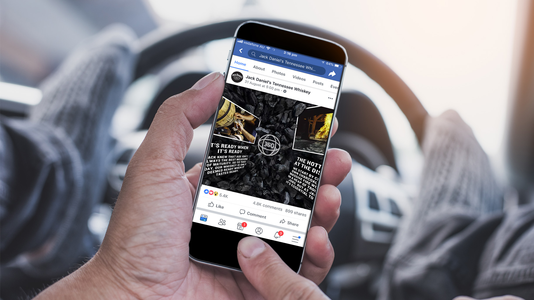
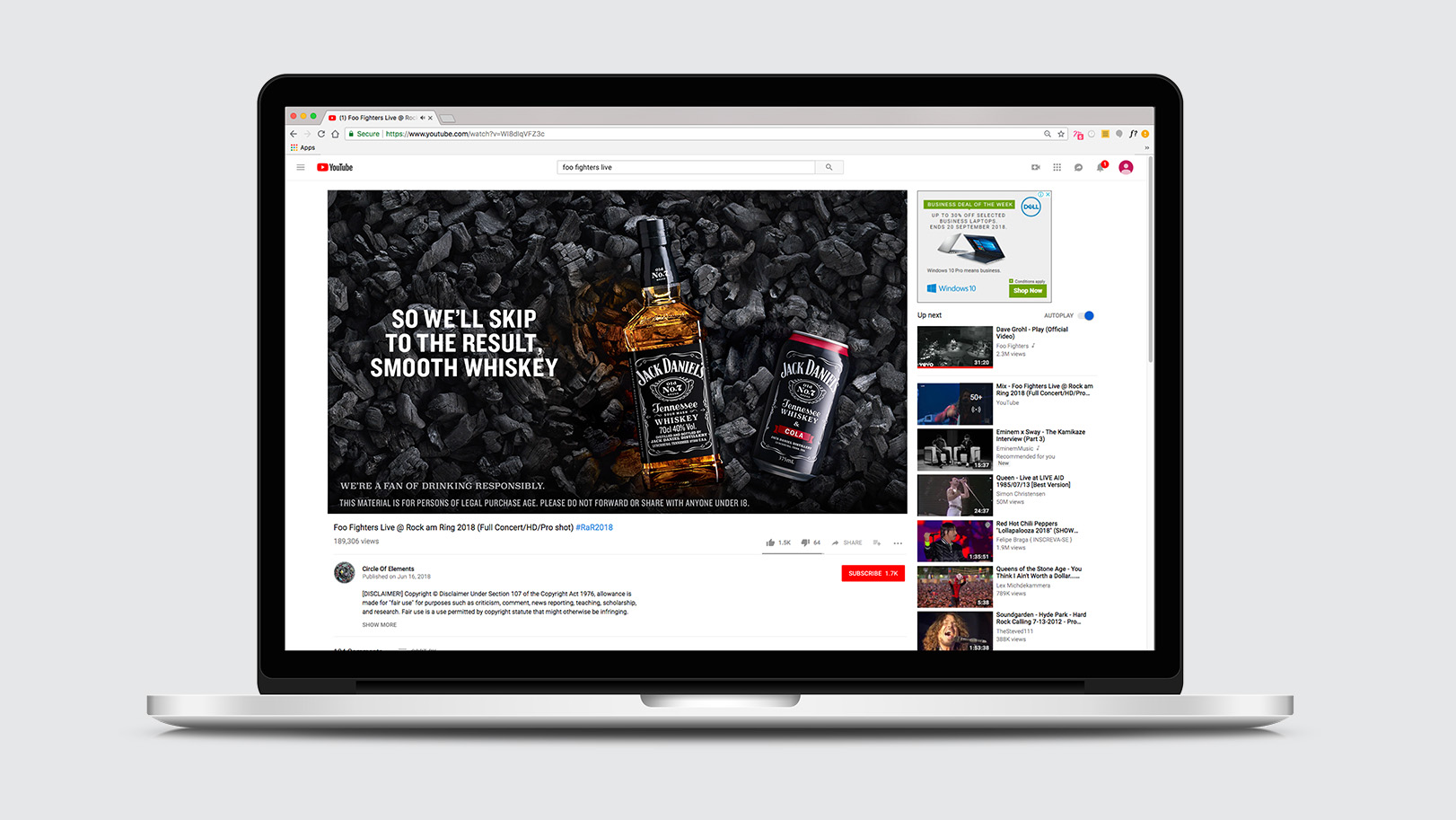
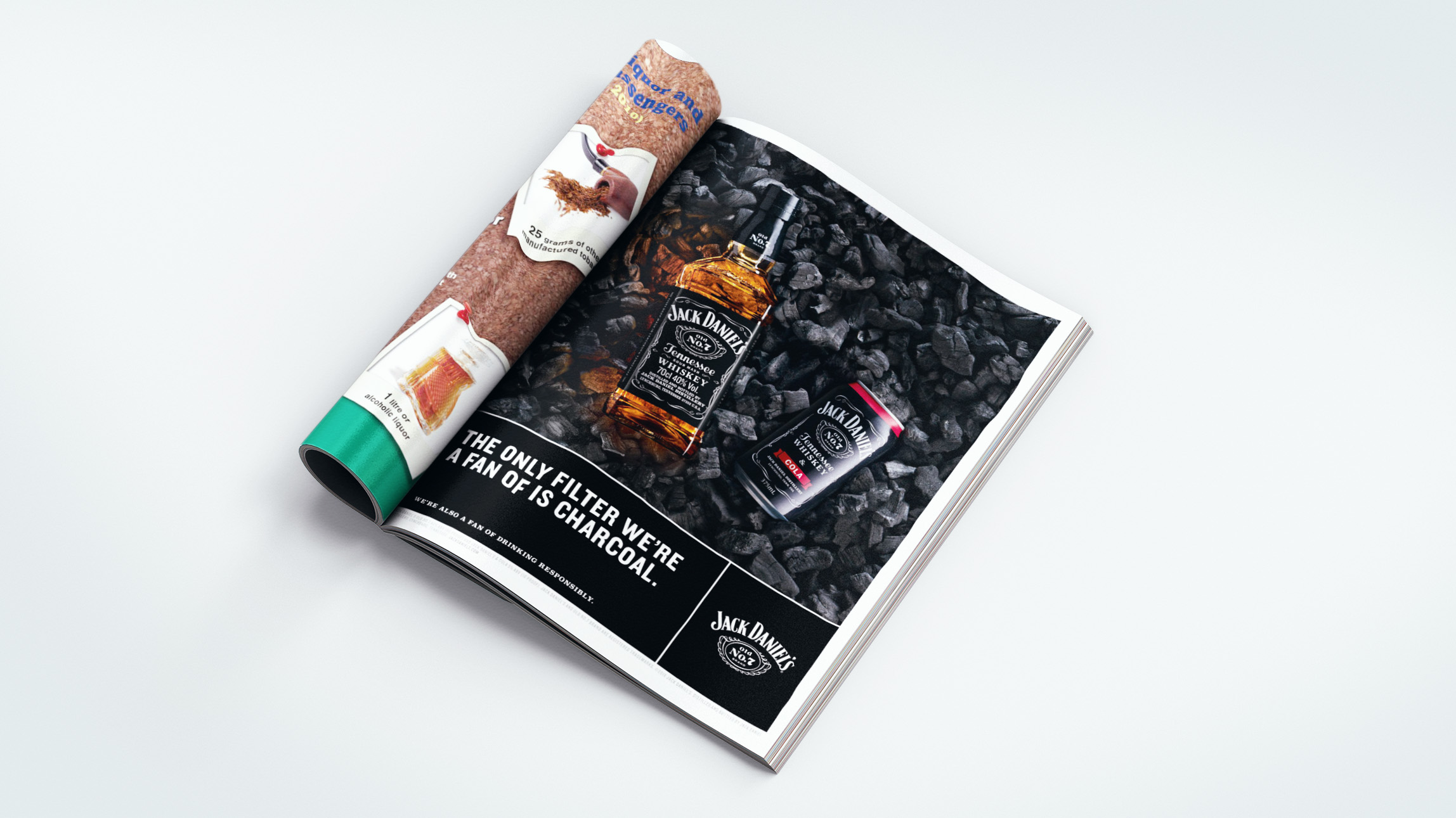
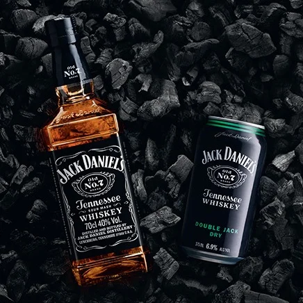
Jack Daniel’s are proud of their process, they filter every drop of their Tennessee Whiskey through 10ft of charcoal.
And this is the story we told. Through clever use of animation in various online channels, digital out of home, even station domination work, we showcased this point, which is what makes Jack Daniel’s whiskey so unique.
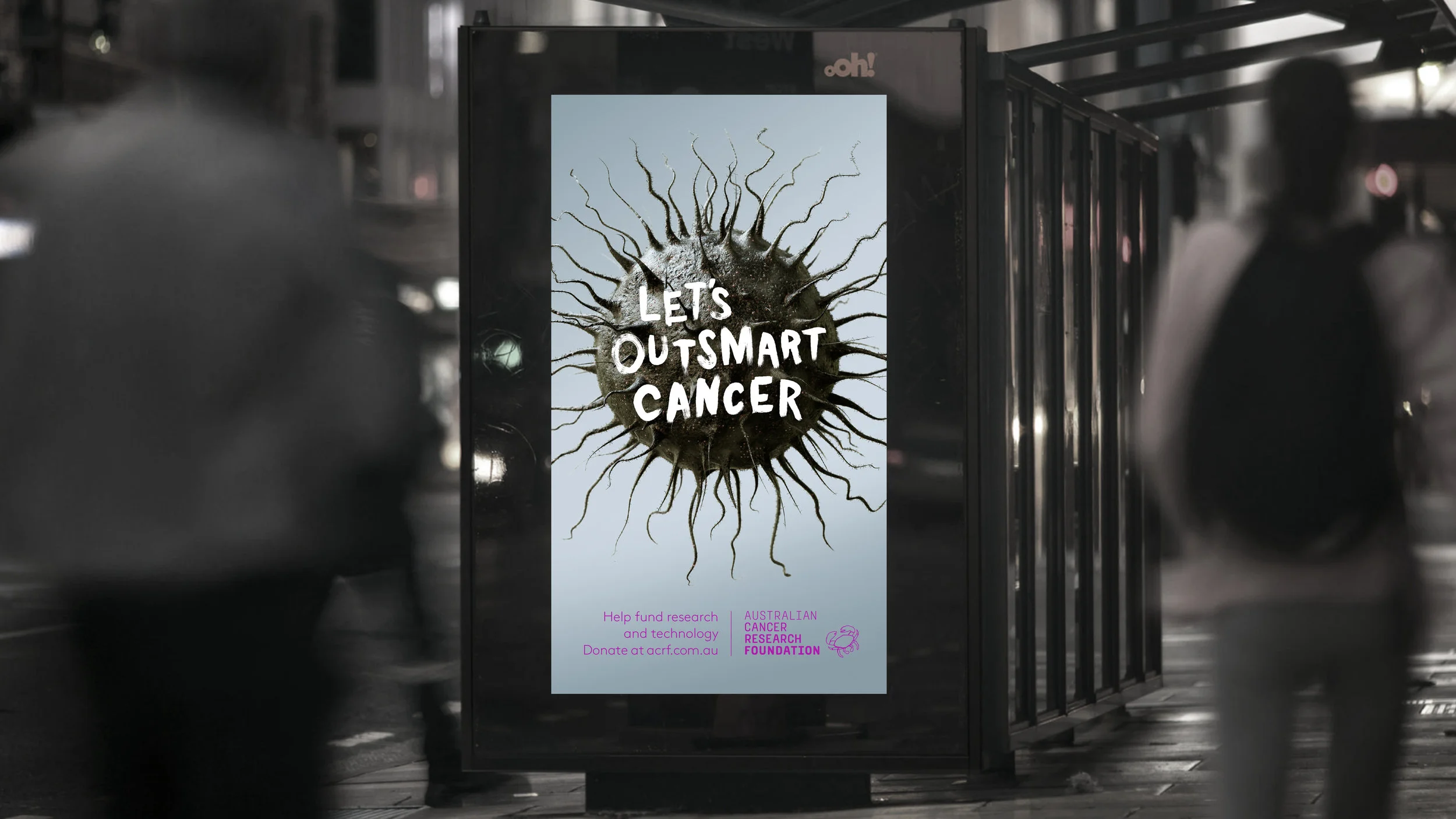
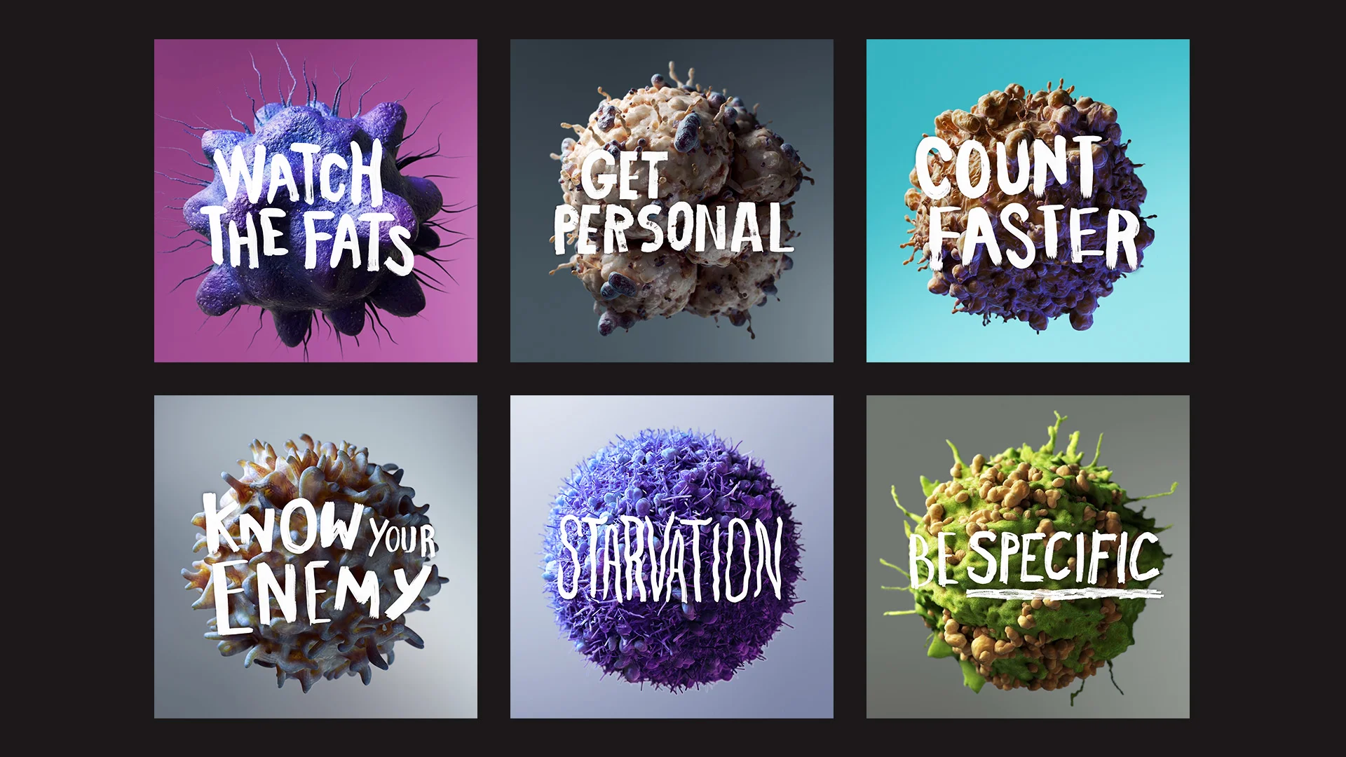
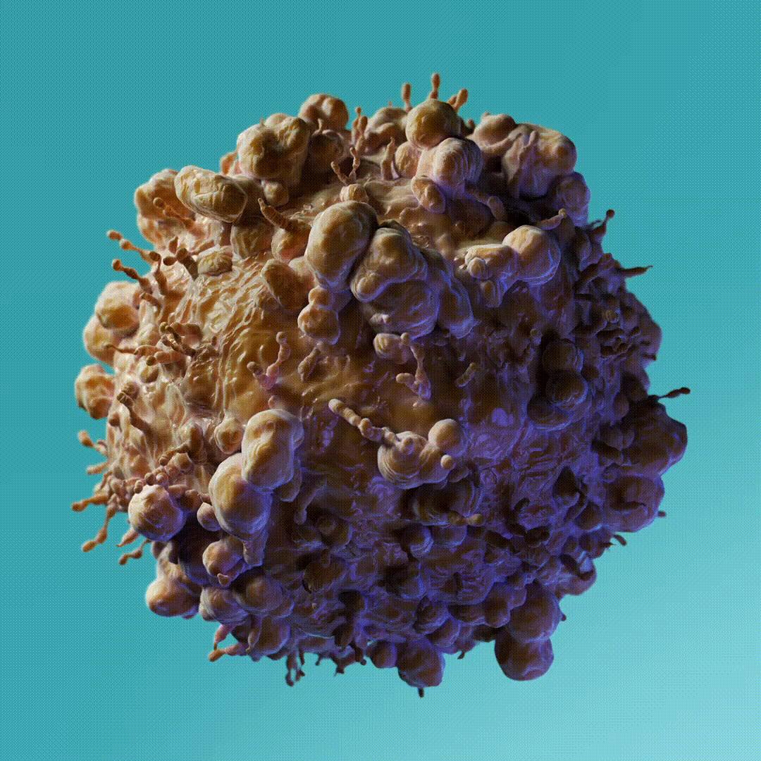
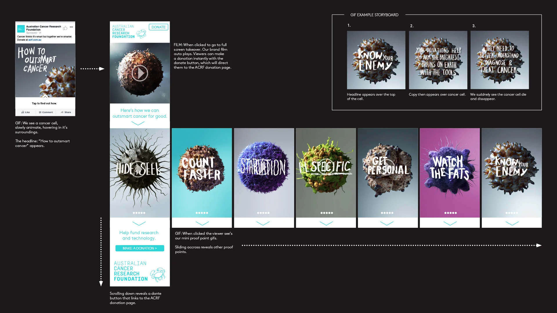
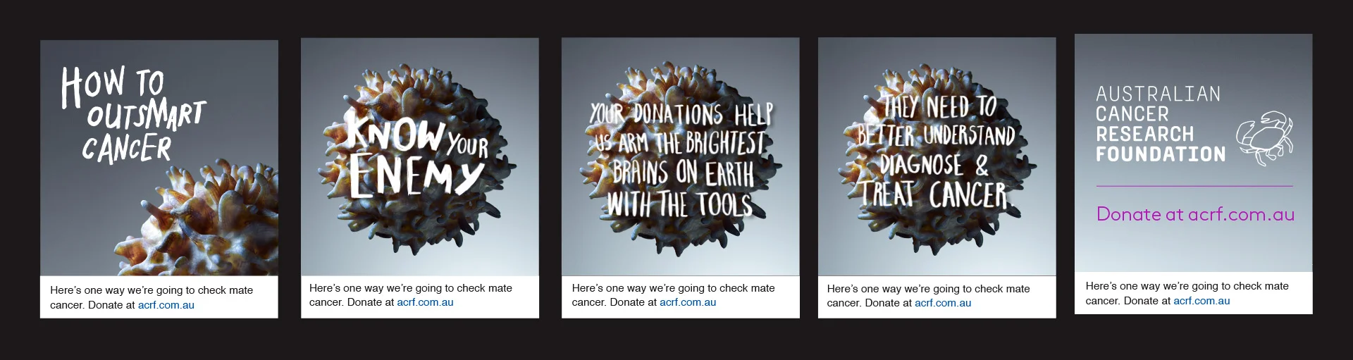
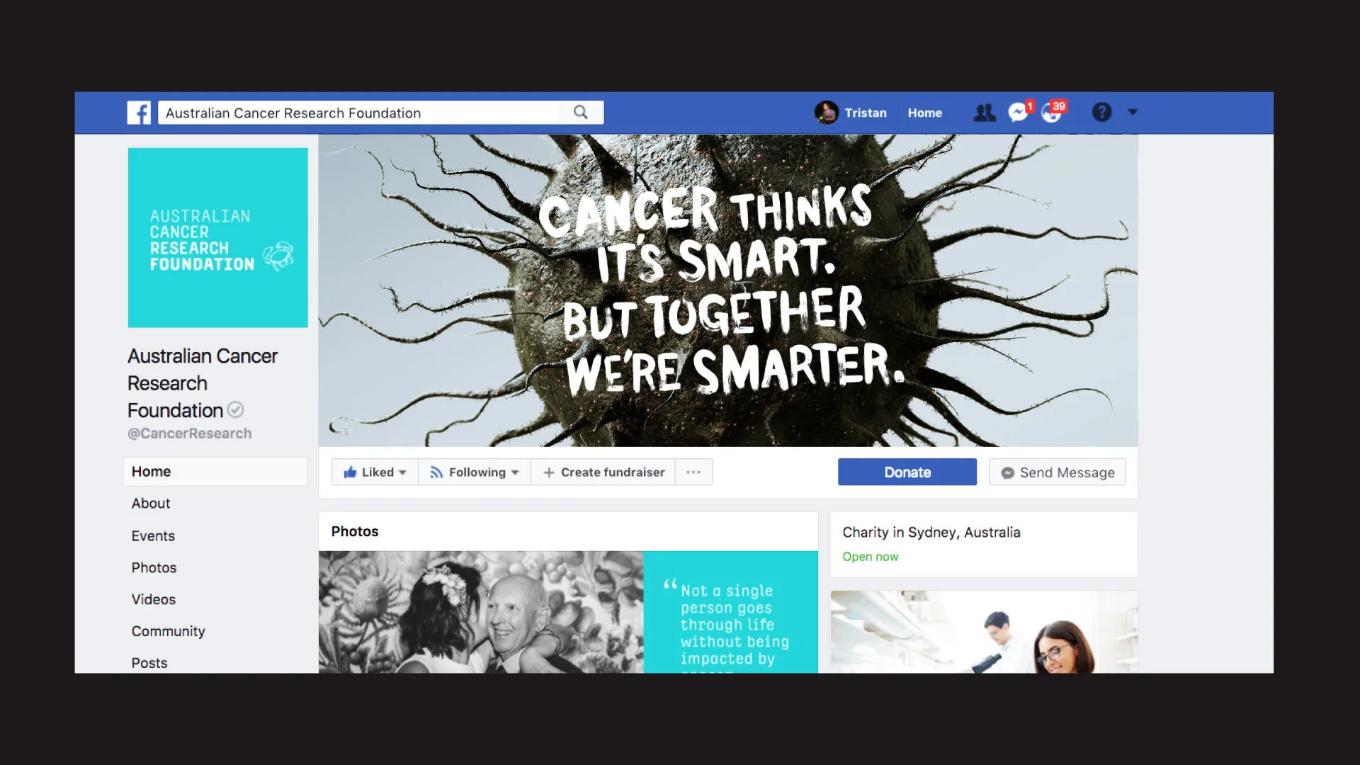
This campaign for the Australian Cancer Research Foundation was designed to point out all of the different research initiatives made possible by peoples donations.
Clean, simple, and looked striking in market thanks to the team at Cream for rendering up such fine graphic depictions of the various cells .
The Flip Group is a multidisciplinary studio. The group consists of Flip Tees: T-shirt designs, Flip Prints: limited edition prints and Flip Studio: the design arm.
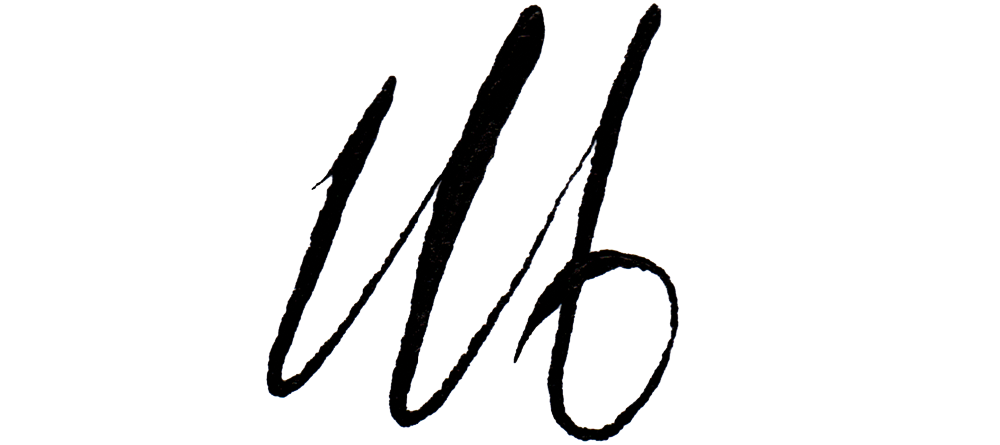
Having a name like Flip and considering the companies various service offerings we felt an Ambigram was the right place to start.
The studio prides itself on thinking differently, hence the site which is currently under construction boasts a fresh parallax upward scroll, a flip on the conventional downward scroll.
Big W run many campaigns through the year, each one needing to adhere to the overarching brand guidelines, while being unique enough to stand out from the last. Here are a few we came up with over the past year or so.
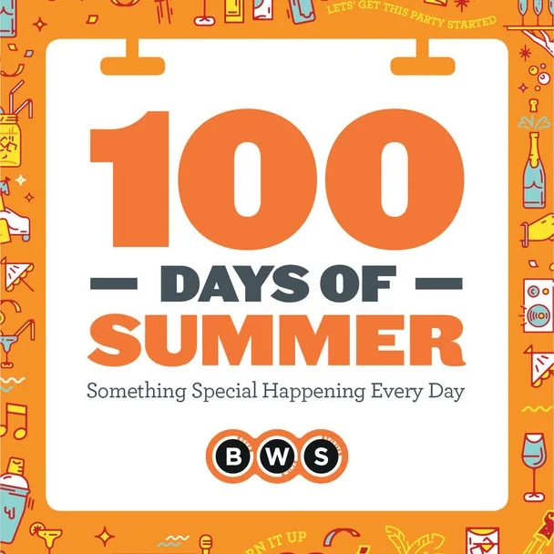
Every year BWS run a campaign called ‘100 Days of Summer’. A new offer is announced to their customers, every day for 100 days. Here are but a few of them that I oversaw.
Three years, three brand updates, and three thousand* pieces of work later, I oversaw CBA brand work from ATM screens and banners, to widespread fully fledged integrated campaigns, and everything in between.
*figure likely not totally accurate
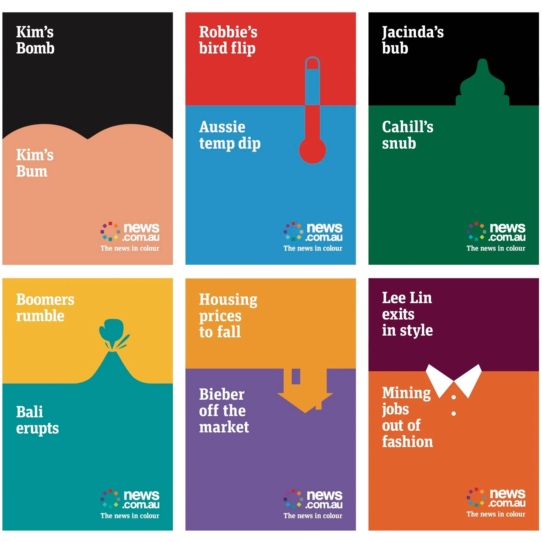
Providing design direction on this campaign proved challenging at times due to the fast moving nature of it, as each story had to be up across various digital out of home placements within 24 hours of the story breaking.
Gallium [Ga] is a metal which melts at 27.9 degrees Celsius. Very weird when you’re holding it in your hand.
Leveraging off the name, and the amoeba like nature of the fast moving content creation business itself, we created the Q symbol with Gallium.
Some branding work for a fantastic restaurant in Sydney’s Leichhardt. I retained the hand lettering of the original logo as not only was it beautifully done, but this institution of a restaurant has been going since 1977.
Shoot to Kill is a film production company based in Sydney. The Business cards and with comps were printed on a completely transparent acetate, which ensured these looked fantastic once finished.
The best time to drink Summer Bright Lager? Summer, naturally.
Many an hour was spent in Photoshop during this campaign…